One Event to a Standard Pattern
Event Completion Window
A completion interface designed for a smaller seasonal event that became the standard pattern across Seafight events.
Role
Game Designer · Interaction Design
Status
Shipped · Standard pattern
Tools
Figma, Confluence, Jira
At a glance
- Problem
- Players read a forum FAQ to work out what an event required. In the game there was no single place to see progress, what was left, or what finishing was worth.
- My contribution
- User flows, Figma mockups and the written specification, followed through to launch. Bigpoint's artists set the visual style and its developers built it.
- Shipped result
- Launched in a smaller seasonal event, needed no changes after launch, and became the standard pattern across Seafight events.
- Why it matters
- Making progress, urgency and rewards readable in one stateful interface, designed as a reusable pattern rather than a one-off screen.
Case study
One window that answered the questions players were asking elsewhere.
This is my clearest example of interaction design that shipped and then got reused: a specific player problem, a documented solution, and a pattern the team adopted across events.
Context and user problem
Seafight is a long-running live browser MMO with a continuous event calendar. Each event has its own objectives, progression and reward package. That information was spread across the interface, and there was no single place to see how far through an event a player was.
Most players relied on an FAQ on the official Seafight forum to understand what an event asked of them. It showed in player questions in community channels, in what the support and community team heard, and in Bigpoint's internal post-event reports. Completion-focused players had no in-game way to see what they had done, what was left, or what finishing was worth.
My contribution and credits
I defined what the window had to tell a player at a glance, mapped the flow and the reusable states it needed, designed the layout as Figma mockups, and wrote the Confluence specification developers and artists built from. I followed implementation through to launch. The shipped layout and behaviour followed my designs.
Bigpoint's artists adapted my mockups to Seafight's visual style, so the final look is theirs. Bigpoint's developers built the feature and QA tested it. Other Bigpoint designers later built the Event Streak feature on top of the pattern. It appears as a second tab in the live window, and that work is theirs.
Constraints
- Fit an already dense MMO interface without adding noise.
- Support events with different structures.
- Work within existing event systems, so new events wouldn't need bespoke interface work.
Solution
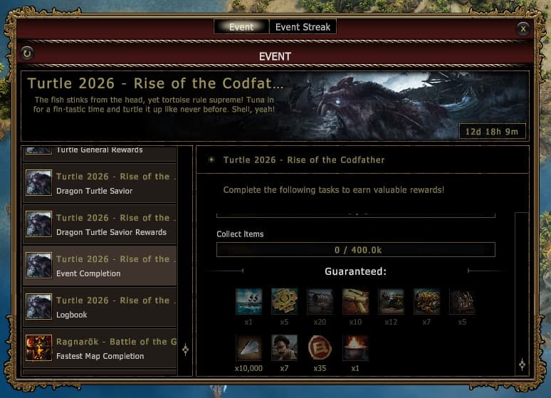
One event window: an entry list on the left with a dedicated Event Completion entry, and a detail panel on the right listing tracked activities such as quests, NPC kills and item collection, each with a progress bar. A guaranteed reward block shows the one-time completion reward, and a countdown shows the time left.
Looking back, the result lets a player answer four questions at a glance: what have I done, what is left, what do I get, and how long do I have.
Recreated UI Mockup
Event Completion Window
A reconstructed event window based on the shipped pattern: category list on the left, active objective and rewards on the right, with progress and urgency visible at a glance.
Reconstruction: layout recreated from the live game with placeholder content, because the original design files are confidential. The shipped visual style is by Bigpoint's artists and the build by Bigpoint's developers.
General rewards
Shared event rewards
Mission chain
Primary completion path
Completion track
Selected objective panel
Bonus tasks
Optional stretch goals
Logbook
Event rules and timing
Season Event Completion
Finish the main event chain to unlock the completion reward bundle and the final state badge.
Completion track
Complete the following tasks to earn the guaranteed reward package.
Guaranteed:
x10,000
x5
x12
x3
x20
x1
x250
x1
What have I already completed?
The selected entry shows finished steps and remaining requirements in one place.
What is left to do?
A task list and progress bars make the next action readable without opening separate windows.
What do I get for finishing?
Guaranteed rewards are visible before commitment, so the completion value is explicit.
Can I still miss anything?
The timer and completion state clarify urgency before the event window closes.
Design decisions
- Built the pattern as reusable states and content rules, so events with different numbers and types of activities could use it without a bespoke redesign.
- Kept the layout compact, with an entry list on the left and a detail panel on the right, so it added guidance without adding noise.
- Showed the guaranteed reward before players commit, so the value of finishing is explicit.
- Specified four edge cases: partly completed tasks, the event ending before a player finishes, the state after the reward is claimed, and events with different structures.
- Borrowed from the statistics and completion pages in Rockstar Games titles, which make long progress lists readable at a glance.
Evidence, and how strong it is
I designed it
- Evidence
- My flows, mockups and specification; the shipped layout and behaviour followed them
- Strength:
- Strong, but the original files are confidential
It shipped and held up
- Evidence
- No changes were needed after launch
- Strength:
- Strong
The team valued it
- Evidence
- Adopted as the standard event pattern and extended by other designers
- Strength:
- Strong
Players found it useful
- Evidence
- Forum and Discord feedback, Bigpoint's internal post-event reports and the community team
- Strength:
- Moderate: qualitative, not measured
Outcome
It launched in a smaller seasonal event and needed no changes after launch. Players liked it and found it useful, according to forum and Discord feedback, internal post-event reports and the community team.
The team adopted it as the standard pattern across Seafight events, and other designers later built the Event Streak feature on top of it.
Limitations
The window also offered a valuable one-time reward, so positive reactions may reflect the loot as much as the clearer information.
There was no usability study and no measured before-and-after. The working Figma and Confluence files are confidential, which is why the mockup and flow here are reconstructions.
What I'd investigate next
Whether the window reduced reliance on the forum FAQ, by comparing FAQ visits or support questions during events before and after.
Whether players who open the window complete more of an event than those who don't, once reward-driven players are accounted for.
Where a first-time player looks first, and whether they find the Event Completion entry without help, through a short task-based test.